
Background
Charlottesville is not the easiest place to ride a bicycle. There are obstacles beyond the narrowness of the streets. Let’s take a look at a few of these.
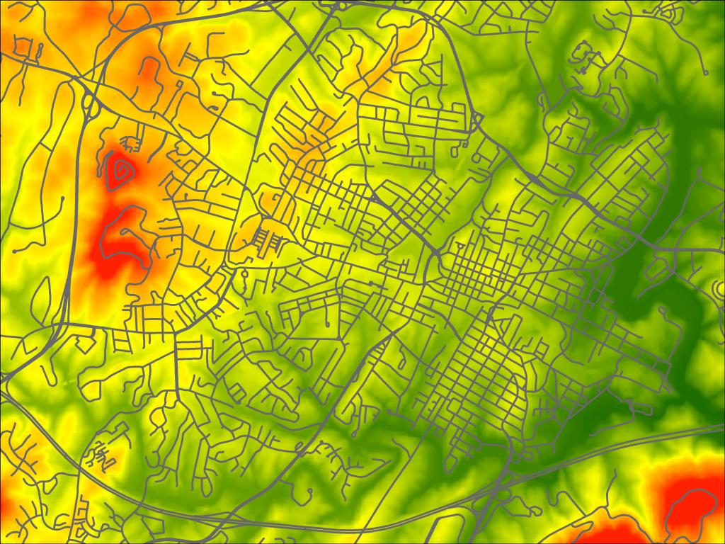
Cville street grid overlaid on elevation surface
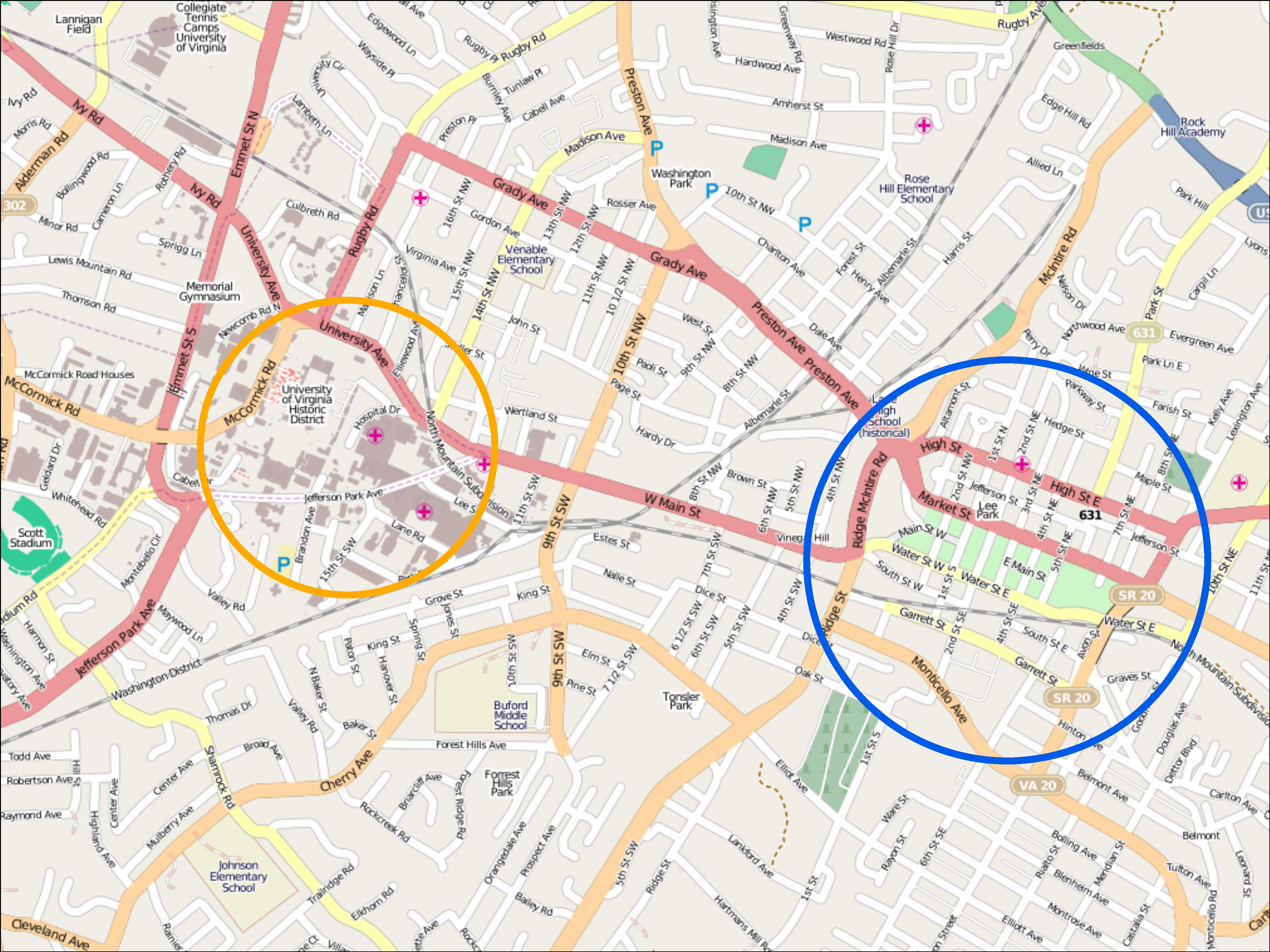
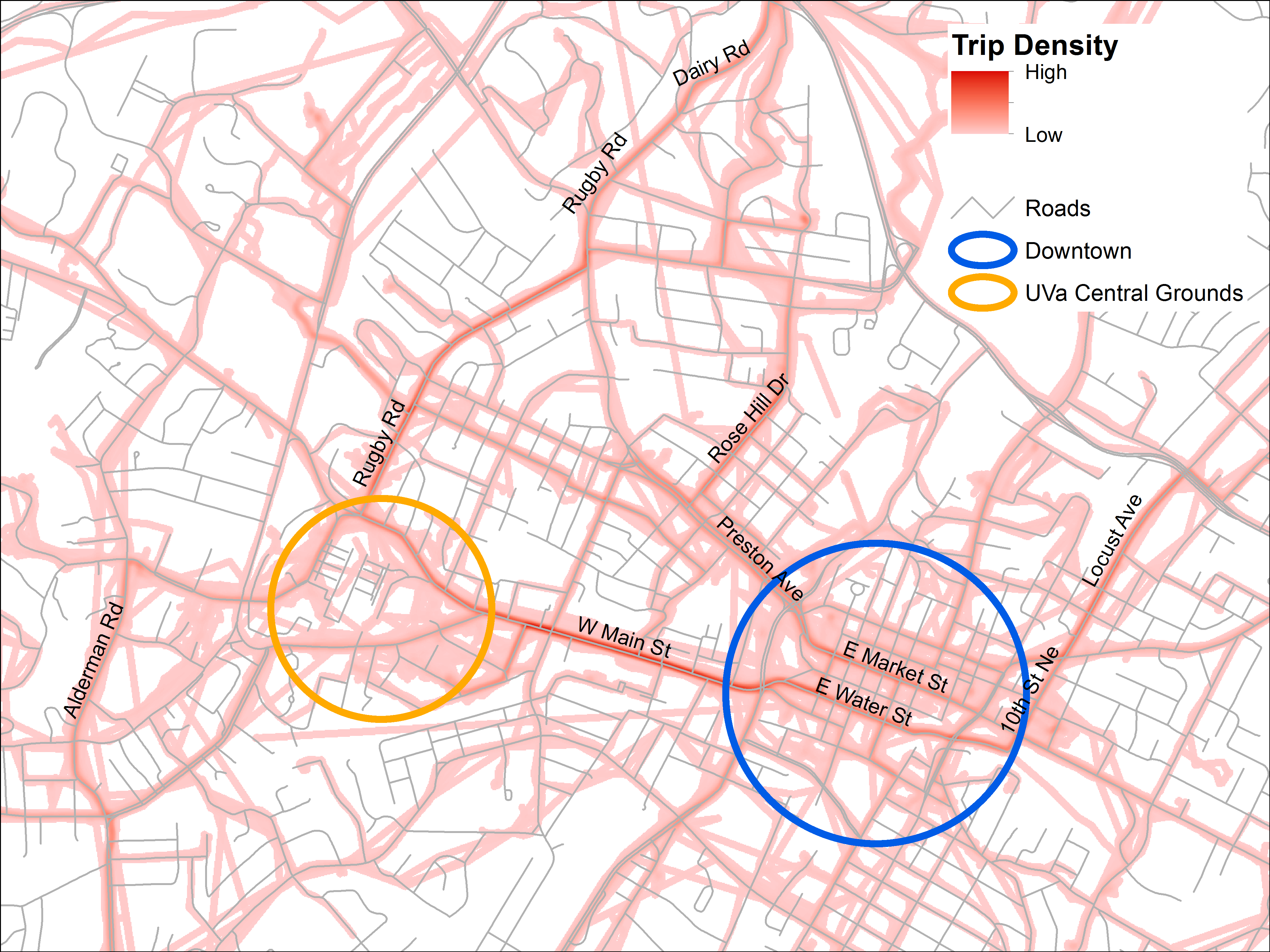
The above map shows the elevation around Charlottesville with dark green being the lowest areas and bright red being the highest. The Charlottesville street system is primarily laid out on top of a series of connected ridges. This fragmented grid leaves only a small number of routes between different “sections” of the street network. Not only that, most of the ridges run in a north/south direction with one going east/west. In the following map, circles (blue for downtown and orange for UVa Central Grounds) show two “employment centers” (those circles will be used as reference in other maps).
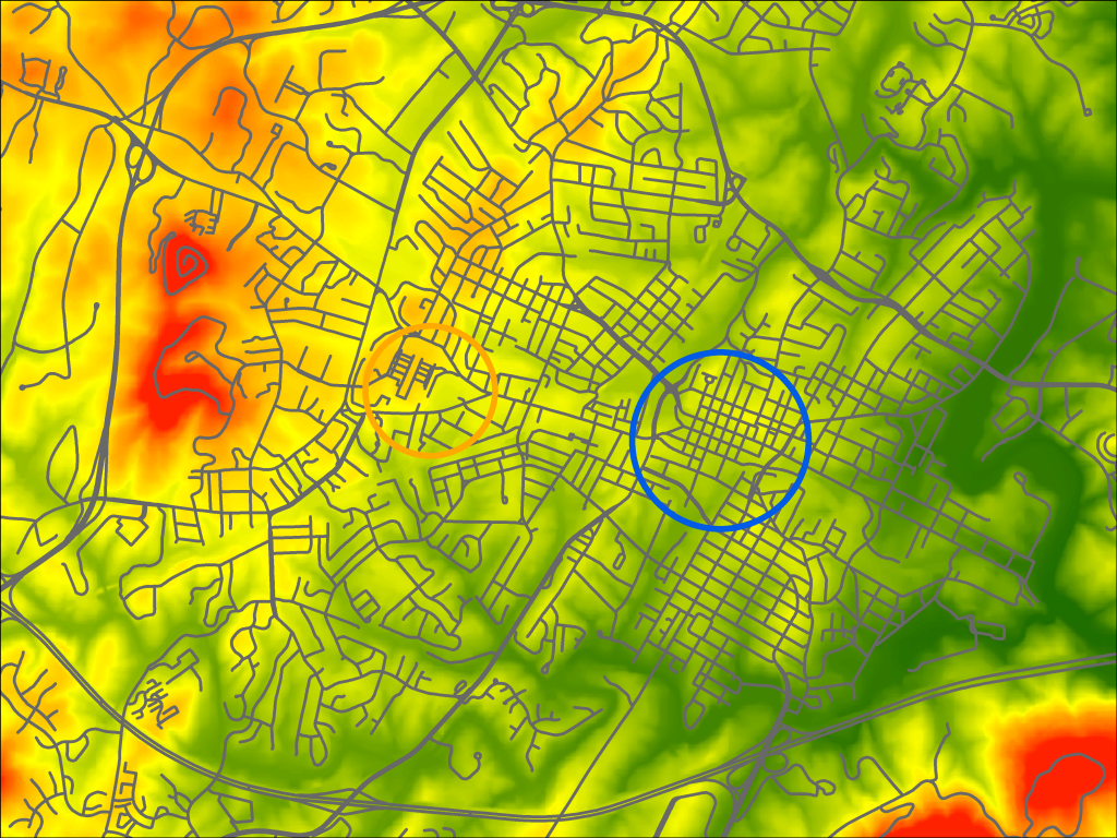
Downtown and UVa reference circles
To make matters worse, there are two rail lines running through town.
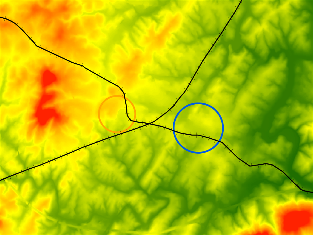
Cville rail corridors
These two lines cross at the train station on W. Main St. They esentially cut the city into four quads.

Cville quadrants
The rail lines further limit the ability to traverse the street network. Below are all the street crossings (over/under rail lines) from one quad to another. The crossings marked in red are not, in my opinion, suitable for bicycles in current configurations.
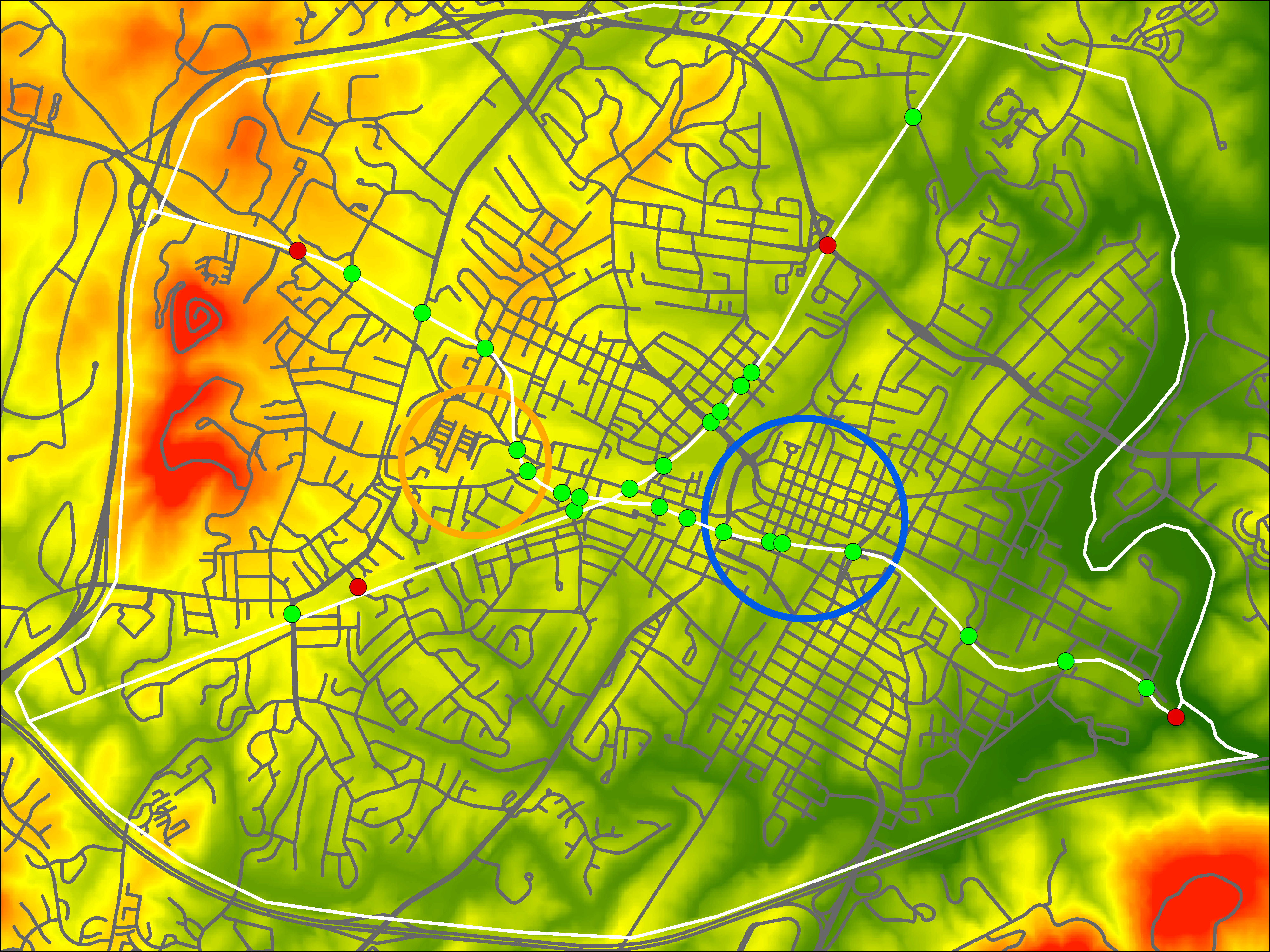
Cville quad passes
That leaves us with some serious bottlenecks for bicycle movement that, not coincidentally, tend to be along busy streets.
Here is a street map to provide context for anyone not familiar with Charlottesville.
Base map uses Open Street Map data
Cville Bike mApp
Back in April of 2012, the Thomas Jefferson Planning District Commission (TJPDC) launched a bicycle route data collection project called Cville Bike mApp. The TJPDC adapted a smart phone apps that allowed users to log all their bicycle trips and share the location data with the TJPDC. Data collection officially closed on May 18. The apps are still available and the TJPDC is still collecting data. The source code can be downloaded here.
Kelly Johnston and I were asked to consult with the TJPDC intern working with the data. We discussed various visualizations and spatial analyses. We asked for and were given permission to have the data to see what we could do. Let the fun begin!
Data Issues
The data arrived after being “cleaned” of many data points. This was necessary because there were many obvious cases where people had left their logging app running after they were at home, work or driving. There were also routes with only a few datapoints over a very large geographic area. The data was in Excel with each record containing a single latitude/longitude pair with trip ID, date and time. There was a separate table listing user ID, trip purpose, weather and notes. There is no personal information in the data we received. Of the data mapped, there were 1011 trips made by and 118 users.
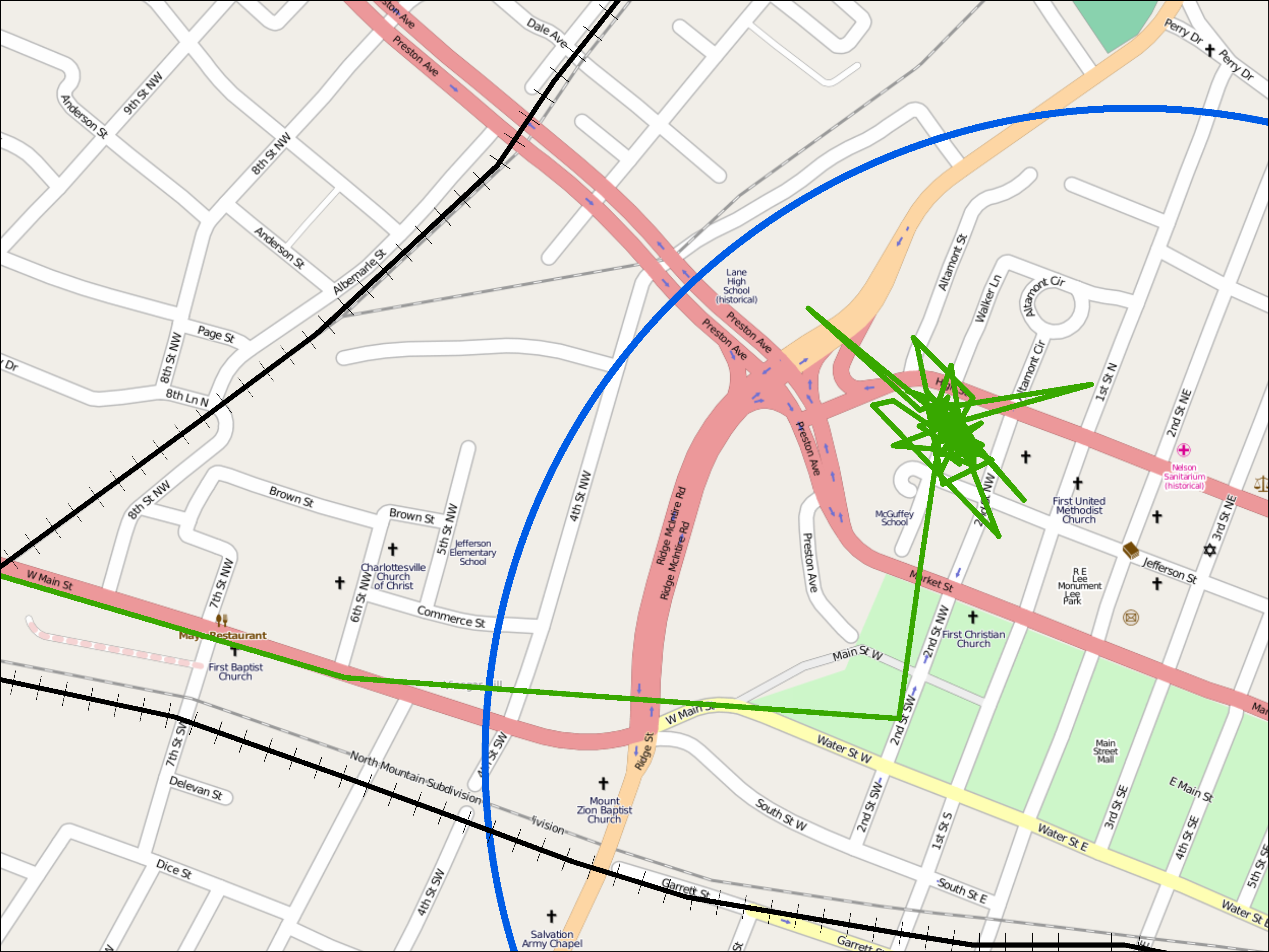
Someone forgot to turn off their app
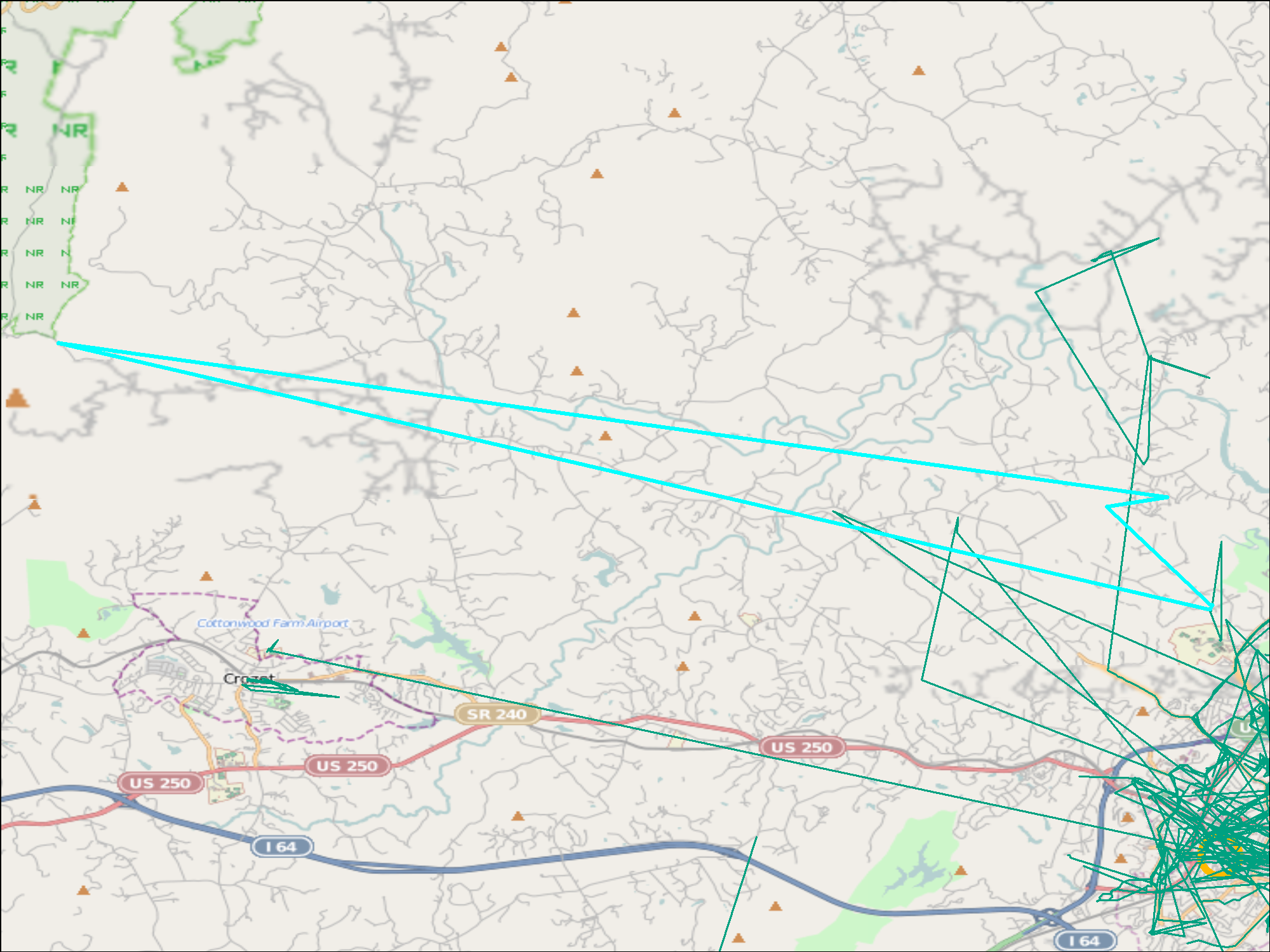
Clearly a few points missing along this route
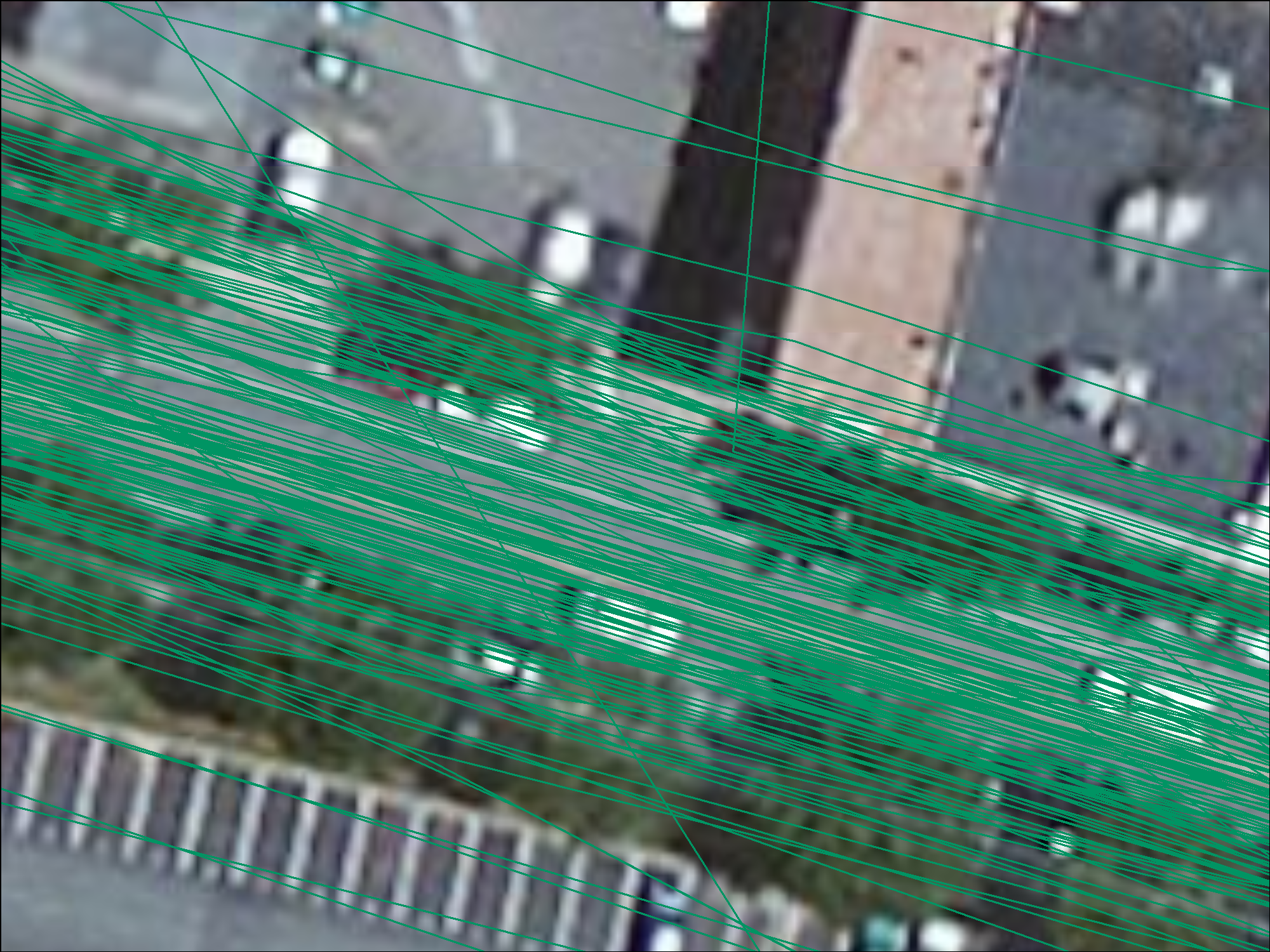
The first idea for visualizing these data was trying to quantify the trips by route. I thought the idea of using a spatial join to aggregate the trips seemed a useful technique. However, there were a few issues with the data. Relying on GPS coordinates from a variety (and quality) of smart phones is problematic.
Main St. Routes
The first technique to try would be to expand the road centerlines using buffers to increase the catchment area for the roads. Then, spatially join the routes to the roads creating a count of unique trips along any roadway section. After a little trial and error, I settled on 60 foot buffers around all the road segments. Of course, this still does not capture all the trips as shown the the image below.
Red lines indicate edge of 60ft buffer
The Visualizations
I ran the spatial join twice, once to capture the total number of trips and once to capture the unique users. I then took these data from the buffers and joined them back to the road centerline to associate the trip and user counts with the centerline files in order to create something like the image below.
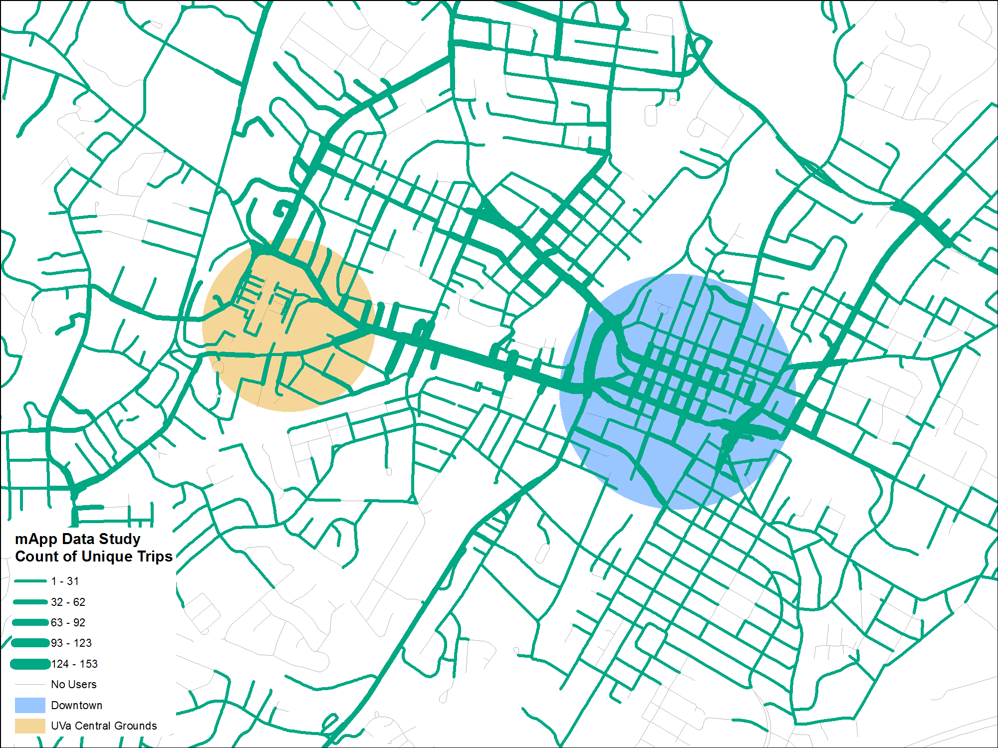
Unique Trips
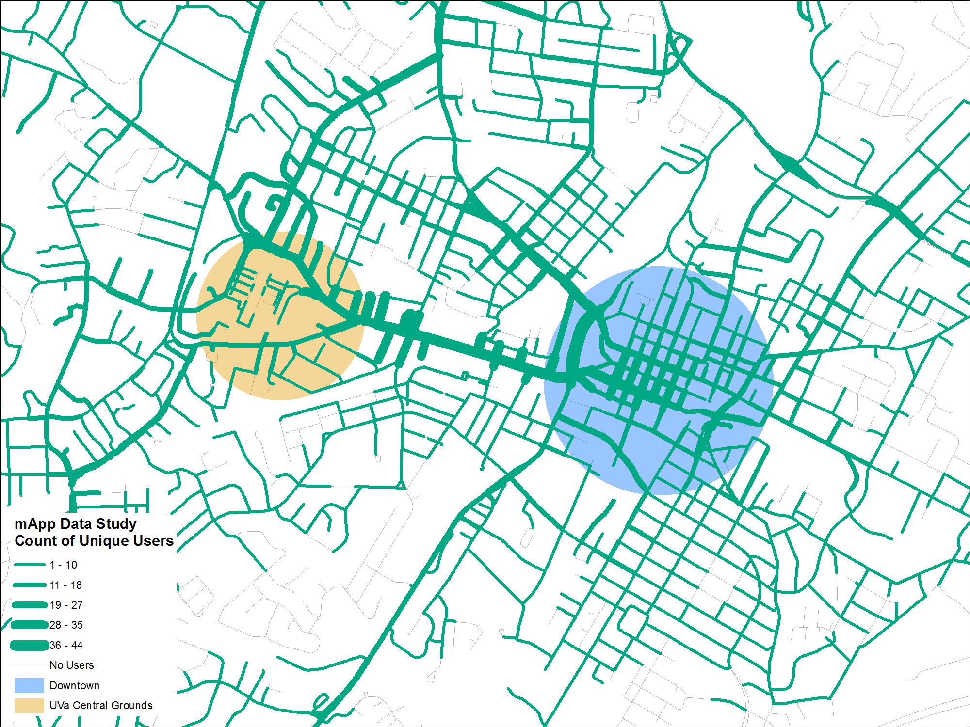
Unique Users
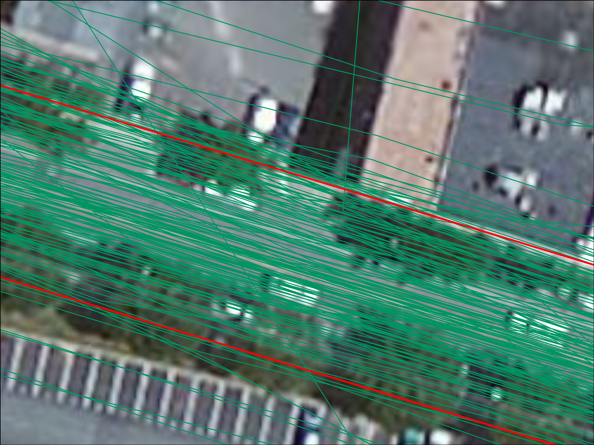
This technique creates some interesting artifacts. When you spatially join relatively inaccurate data like these, some of the aggregated features will end up being associated with features that were not meant to be. In other words, side streets that were not or lightly used end up with much higher counts than they should have. Case in point, W. Main St: is it possible that riders deviated to all the side streets and returned back to Main?
Side street issue
Of course, the answer is no and the problem becomes acutely clear when the trip data is overlaid.
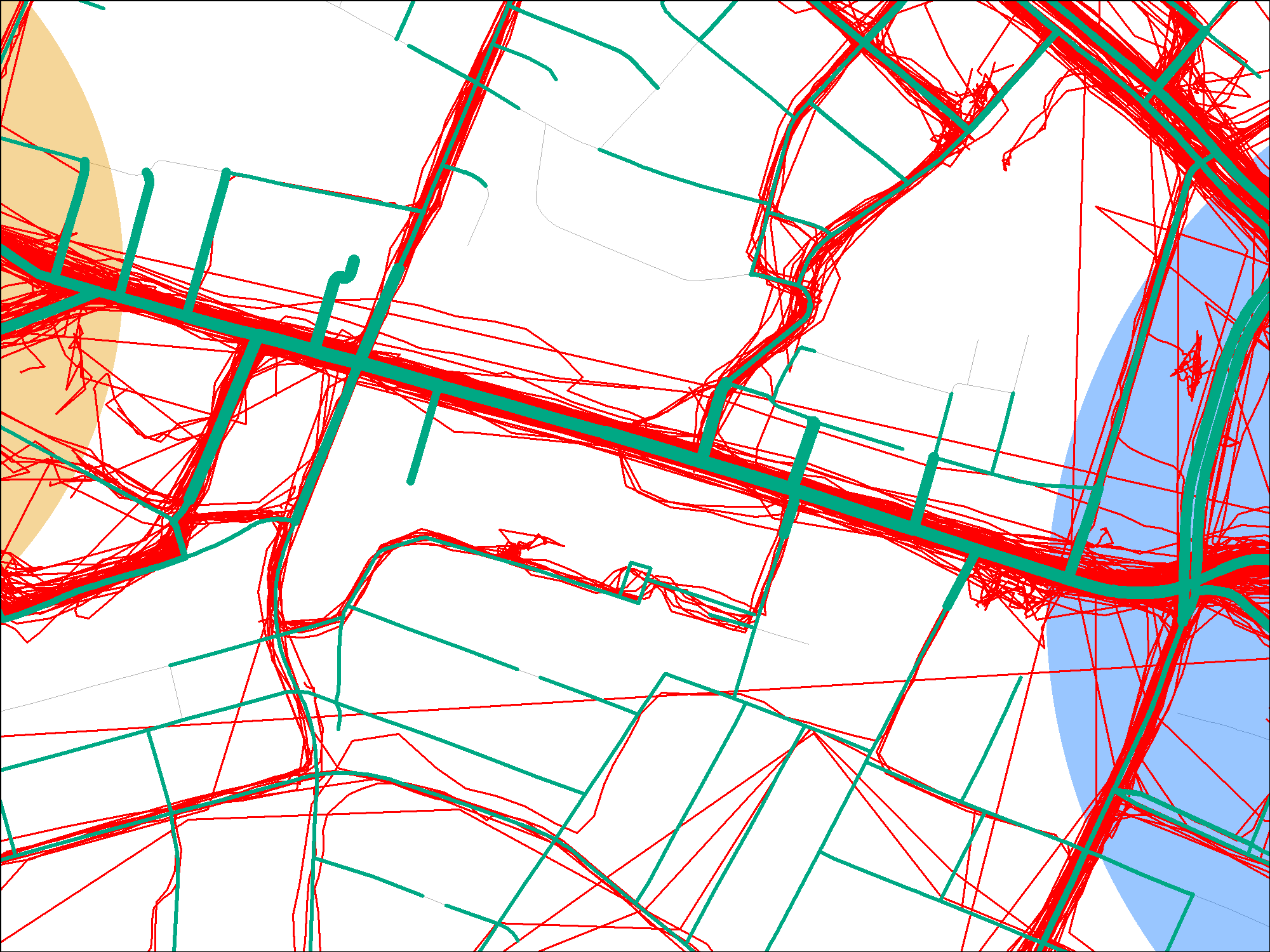
Lack of accuracy
So, the buffer segments of the side streets nearest to W. Main St. were picking up trips along Main St. I tried several times to deal with this using various techniques and found nothing very helpful. Next option? Move to raster analysis. I used a tool in ArcMap called Line Density to create a surface raster of all the unique trips.
Trip density surface raster
The map above clearly shows the most traveled streets in the study are W. Main St., Rugby Rd./Dairy Rd., Alderman Rd., Water St., Market St., Preston Ave., Rose Hill Dr. and 10th St. NE/Locust Ave. There is also heavy traffic on the path between Rugby and Emmett adjacent to Lambeth Field.
The phone app also asked people to log the type of trip. This is mapable!
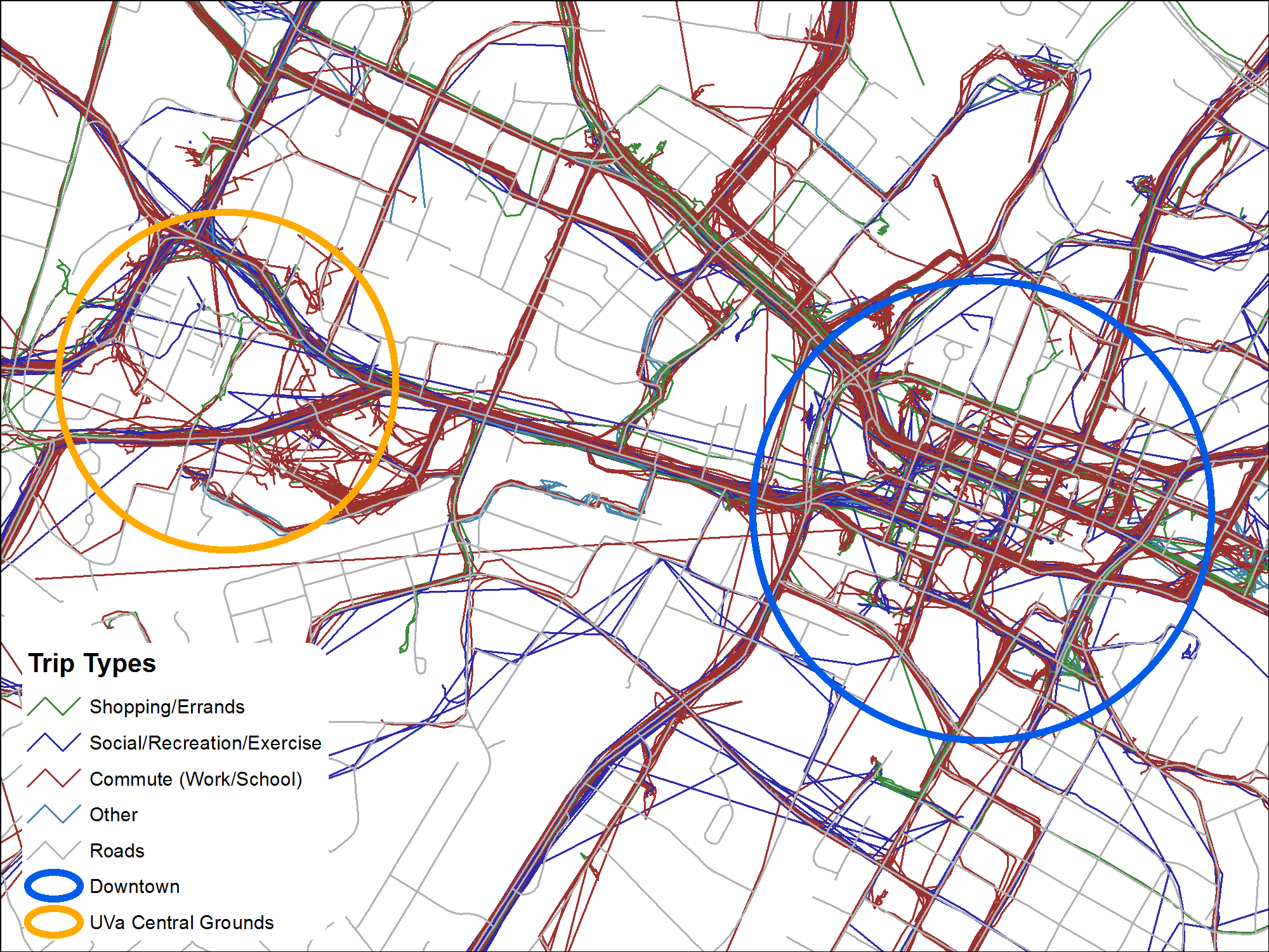
Trips by type
As you can see in the map, commuting seems to outweigh the other trip types. What about densities for these types? I decided to make a map with a series of small multiple maps to demonstrate the densities of the four categories of trips I identified.
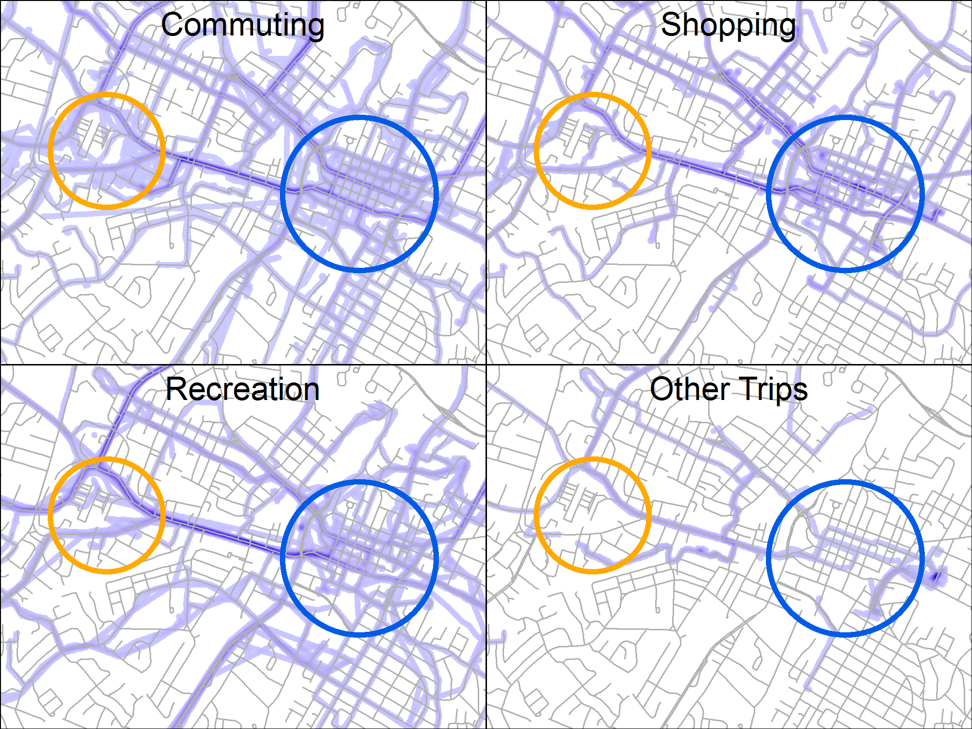
A series of small multiples - term coined by E. Tufte
Clearly, there is a lack of data evident in at least one category. However, I think there is a definite difference between the four types of rides. This led me to look at the origination and destination of commuting trips.
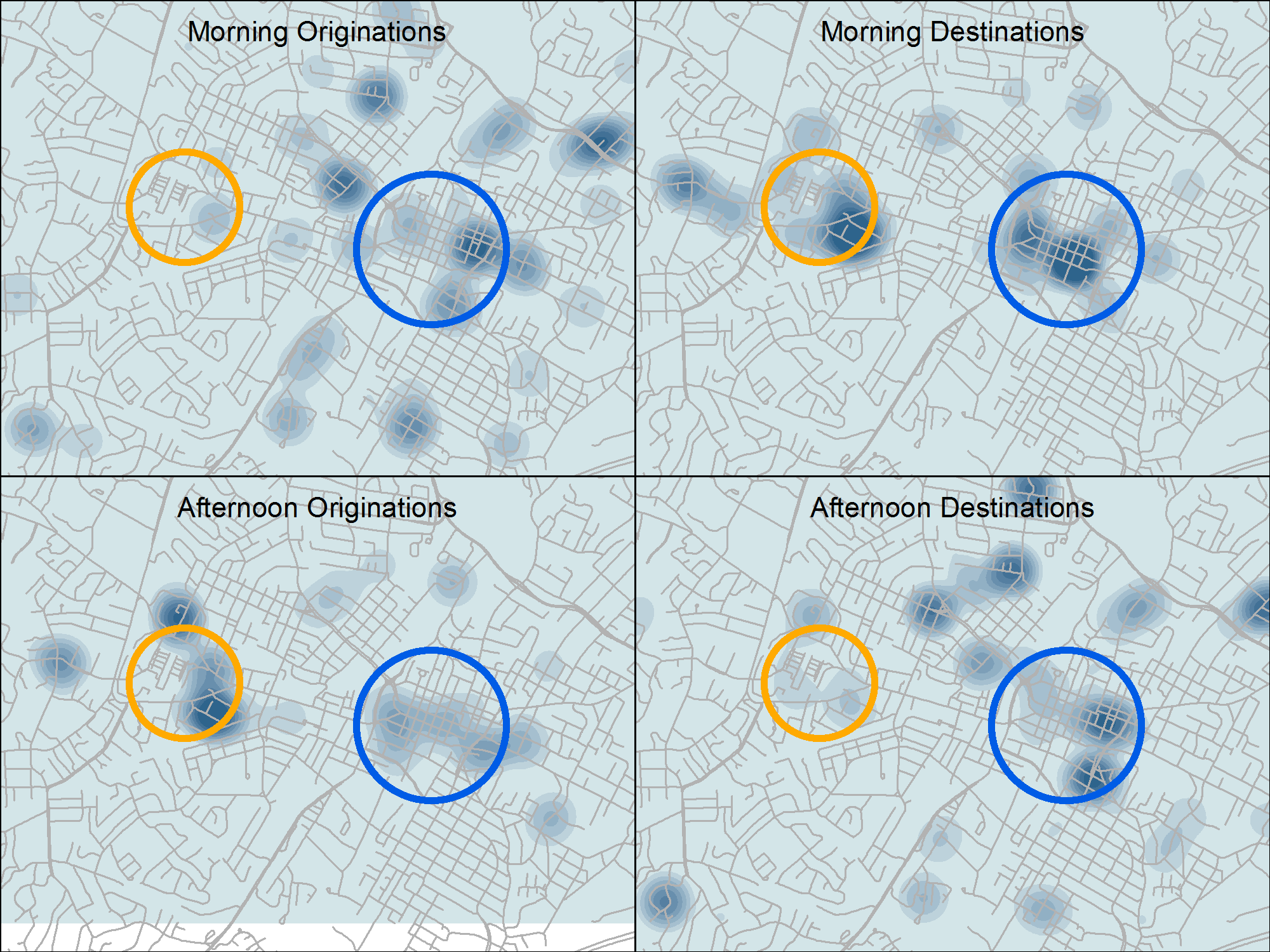
Originations/destinations raster
Other than the fact that downtown is both a hot spot in morning and afternoon for originations and destinations, I am not sure what else can be gleaned from that map.
I also wanted to see how steep slopes compared to the heaviest used routes. I created a slope layer to show the steep slopes and overlayed the route density layer.
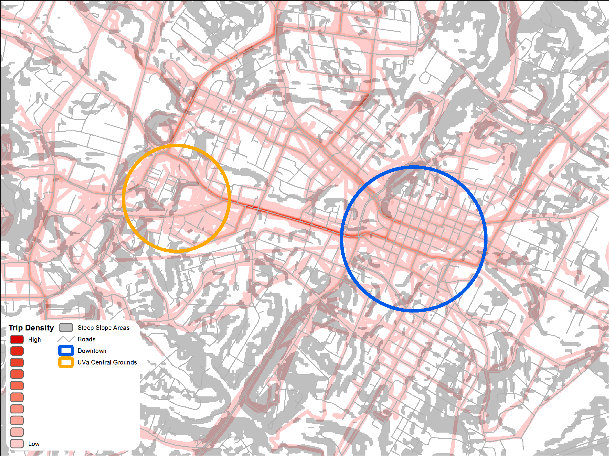
Trip density raster overlaid w/ steep slopes
As you can see, there is not a great deal of overlap between the most heavily used routes and high slope areas. In those areas where there is overlap, most tend to be where the slope is just off the road and does not represent the road grade as along 5th St. Extended or Market St between 2nd St. NW and McIntire Rd.
Findings
I don’t think there are many surprises in this data. Cyclists tend to take the flattest routes or at least the ones that don’t have steep climbs. W. Main St. is the highest trafficked area. Locust Ave., Rose Hill Dr. and Rugby Rd. are north/south collectors for that corridor. This phenomenon has two causes in my opinion. First, W. Main is the flat, straight corridor between the two largest population/employment centers in Charlottesville, UVa and Downtown. Secondly, as mentioned earlier, W. Main is the only east/west oriented ridge in the city.
What I do find interesting is some of the alternative paths cyclists are taking. The 8th St. NW connector (one of my favorite short cuts) under the railroad to the 10th and Page neighborhood connects to a parking lot underpass that bypasses W. Main St. The extension of the parking lot leads to 7th St. SW which leads to a road within a condominium development (Walker Square). This route extends to Grove St. and Roosevelt Brown Blvd. (and the UVa Hospital). This path traverses all four quads, takes advantage of three underpasses, and uses very little in the way of busy streets without bike lanes.
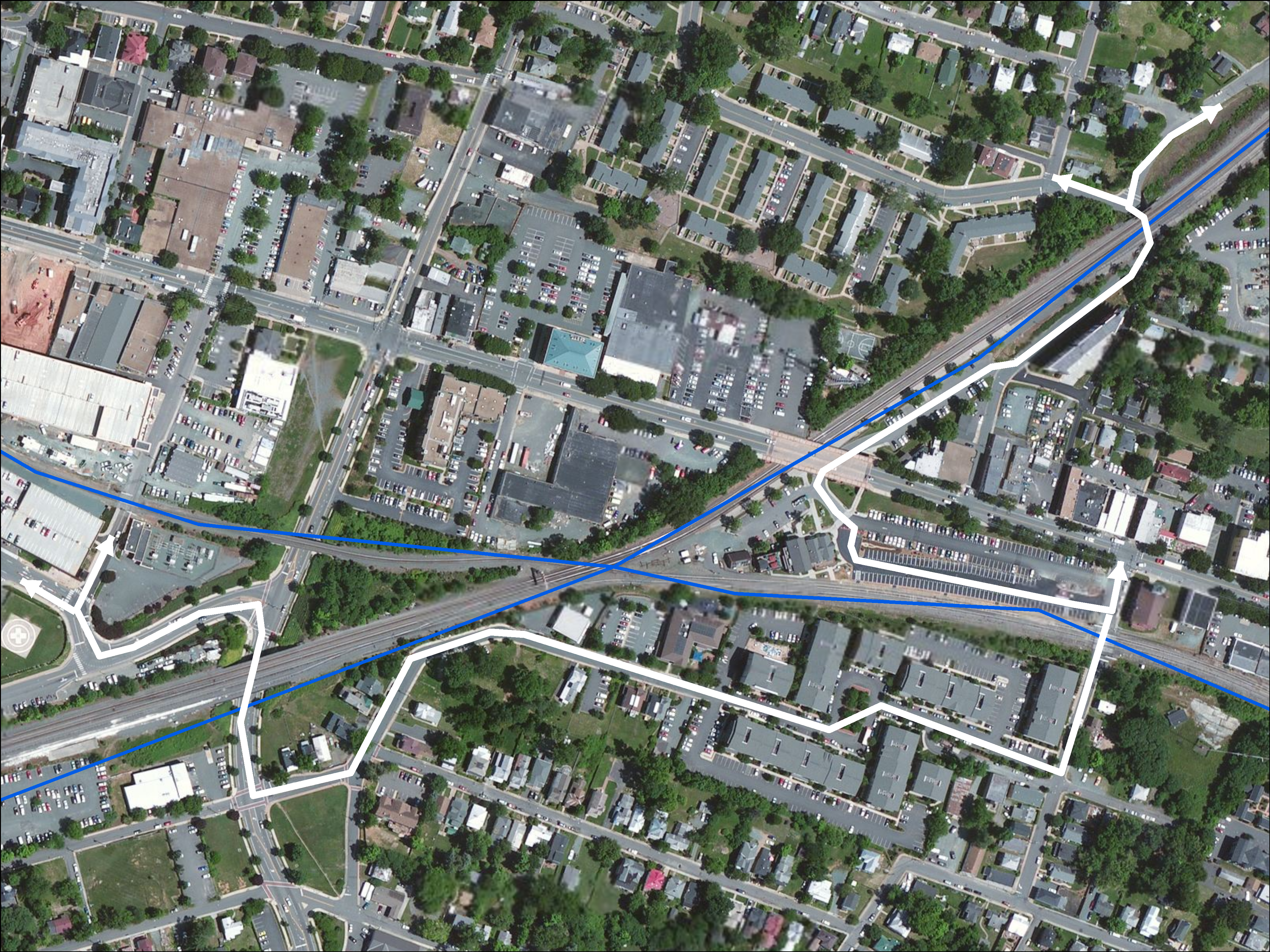
The four quad alternative
Here is a rather heavily used route along the bike/ped pathway from from Ruby Rd. to Emmett St. This path connects UVa to Barracks Road Shopping Center.
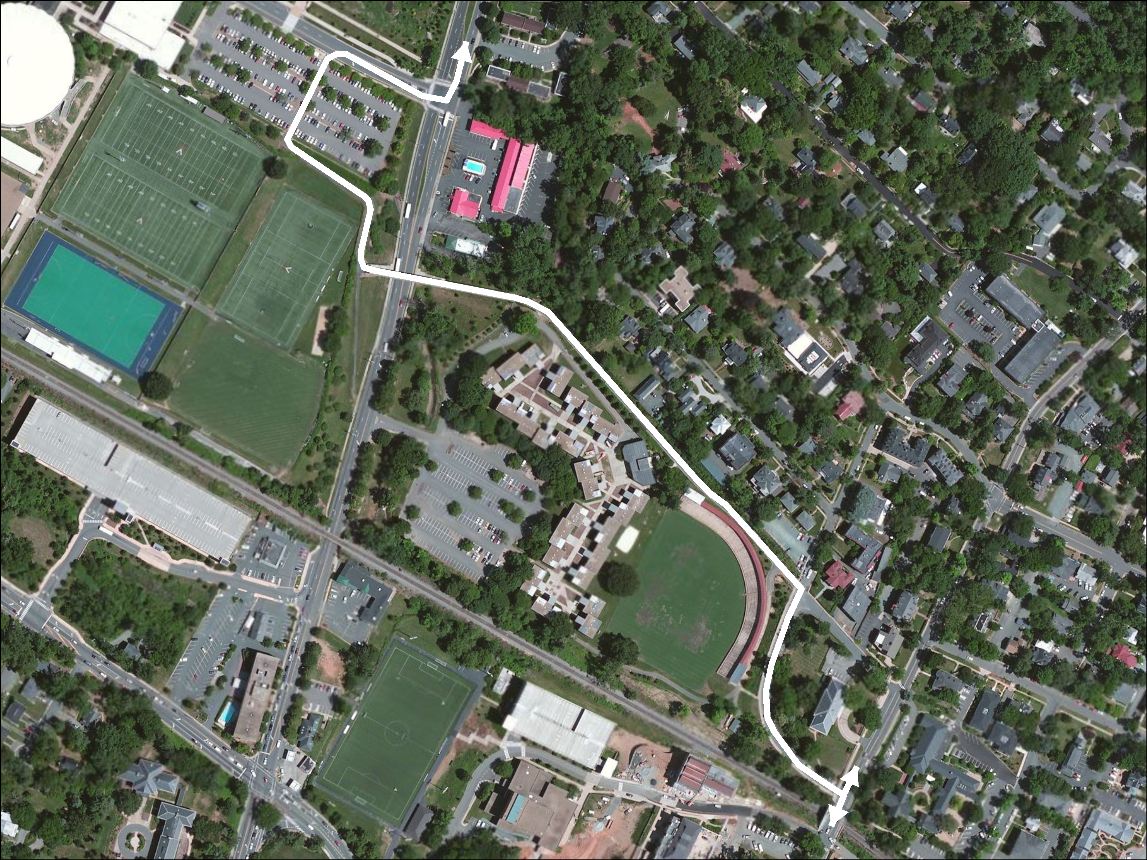
Lambeth bike/ped path
Another large barrier is the Rivanna River. The past few years have seen a good deal of development on Pantops east of town. The only way to get there is over Free Bridge on the US 250 Bypass. Neeldess to say, that is not an inviting route for cyclists. There are paths on both sides of the river. There needs to be a bridge connecting them.

Dream crossing for the Rivanna River</figcaption> </figure>
Conclusion
This type of data collection has inherent issues. Only people with smart phones can participate, which really limits the sample size and variety. While always improving, there is a lack of locational accuracy with smart phones. The phone apps require the user to start and stop the app at the appropriate times. These issues lead to a small amount of collected data that has to be further slimmed into “good data.” There is also seems to be a distinctive lack of data around UVa. The timing of the study did not allow for UVa students to fully participate since they were either in exams or on break for a good portion of the study time. However given a larger sample of riders over a longer period of time, I think some meaningful results would be forthcoming. I urge the planning commission and local governments to consider more of this type of survey to gather better data.
If you have some ideas about better ways to visualize or analyze these data, I would love to hear about it.